Branding

DOTS

Client

Potine

Role

Branding

Duration

1 Jan 2025

Designer

Channa Chheng

Project overview

EUSEA Logistic is a modern shipping brand connecting Europe and Asia through efficient and reliable logistics solutions. The minimalist design approach represents connectivity, movement, and trust, creating a clean and recognizable brand identity across digital and physical applications.

Challenge & Result

01. Challenge

Designing a logo for EUSEA required balancing a professional look with a fresh and approachable feel to represent the food logistics sector. The challenge was to visually convey the international shipping connection between Asia and the EU while keeping the design simple and versatile for multiple uses.

02. Result

The final logo successfully captures EUSEA’s brand values of freshness, reliability, and global reach. The unique “S” shape with directional arrows clearly communicates the two-way shipping flow, and the green color reinforces freshness. The logo and brand system have been effectively applied across various platforms, enhancing brand recognition and consistency.

Advertising

01. Social Media

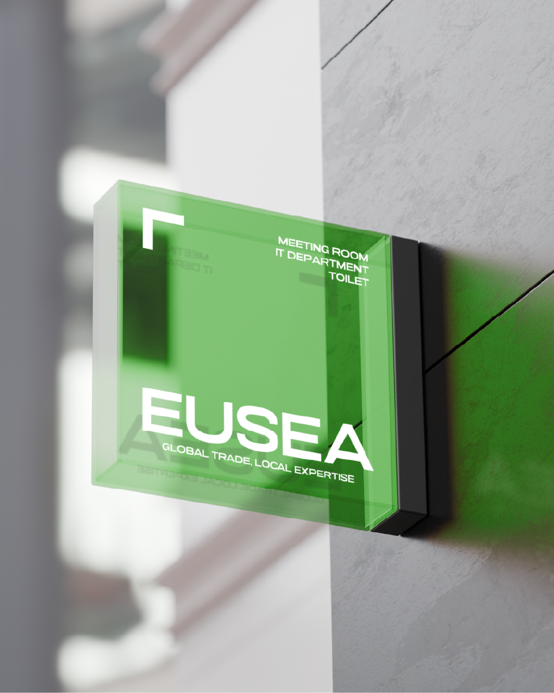
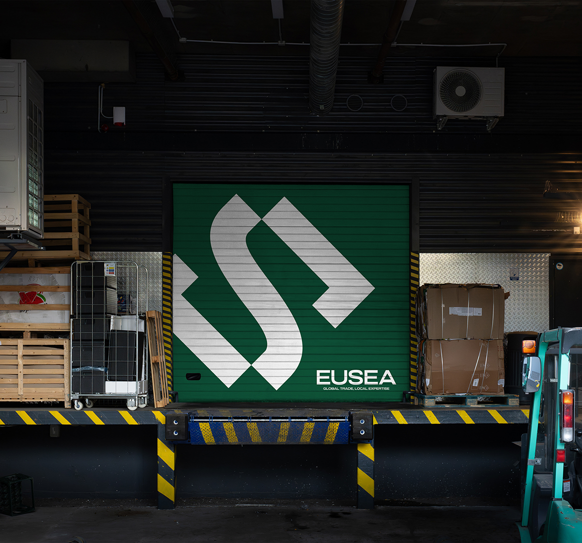
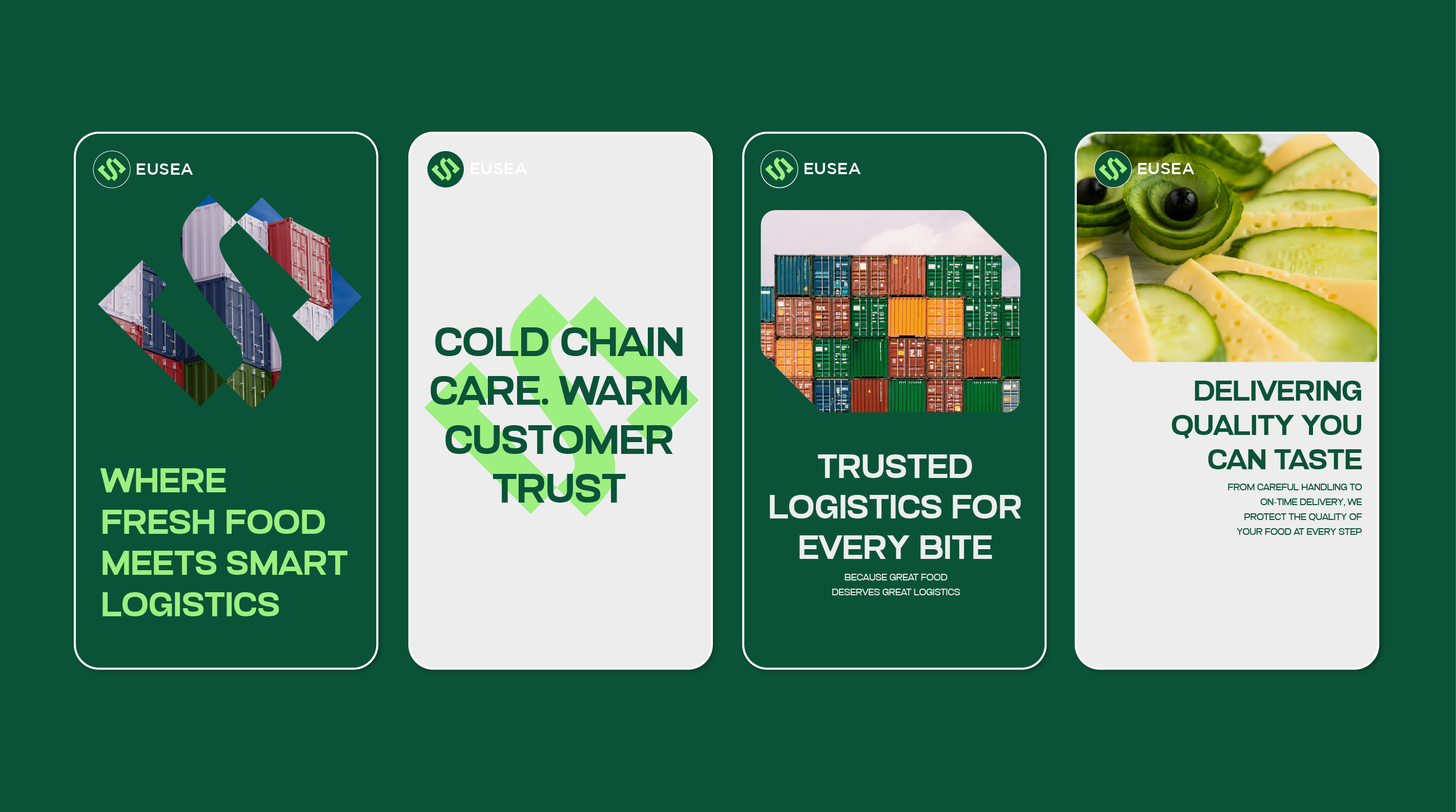
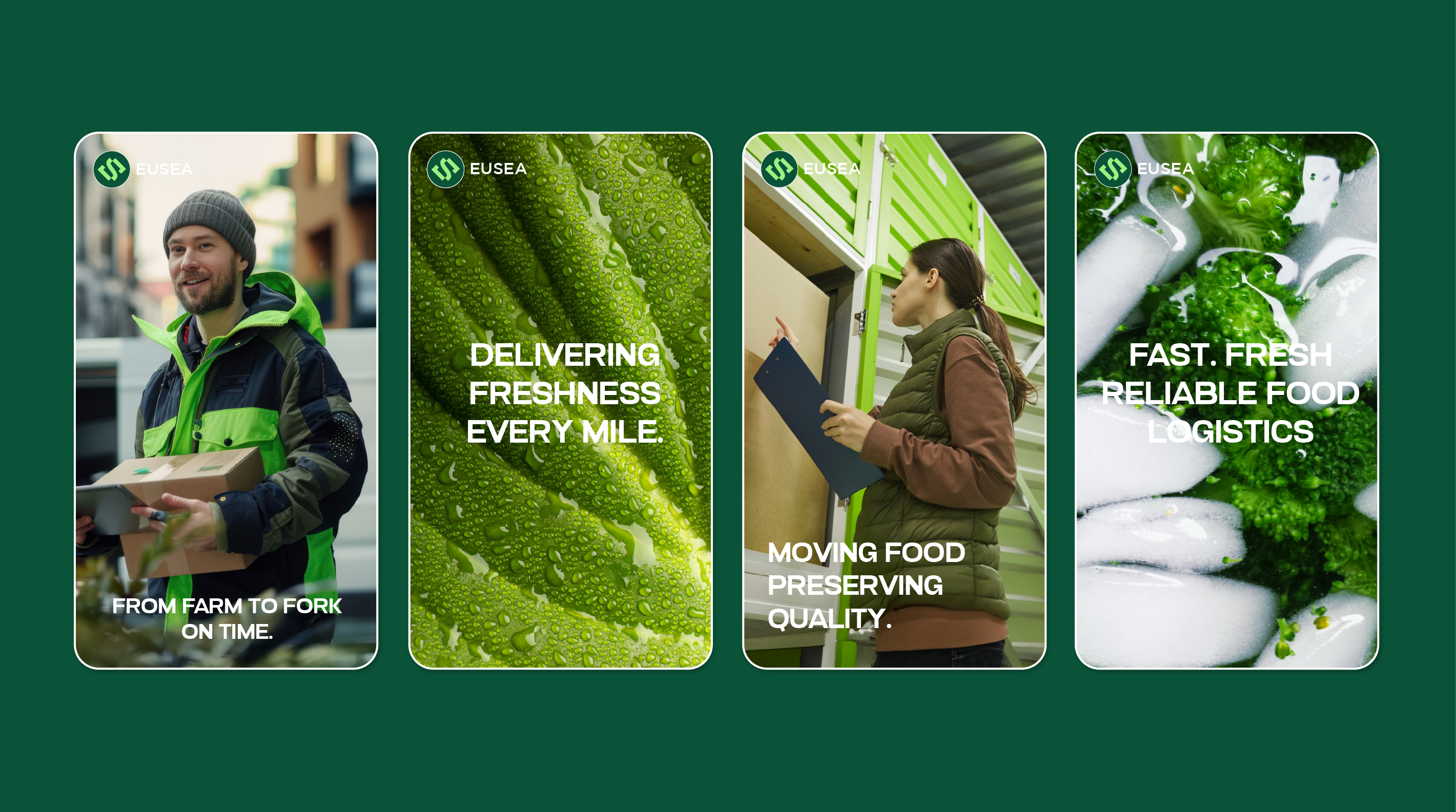
This social media poster design for EUSEA Logistic emphasizes a fast and fresh food delivery identity. Bright, fresh food visuals, dynamic composition, and clear typography communicate speed, freshness, and reliability, making the brand stand out across digital platforms.