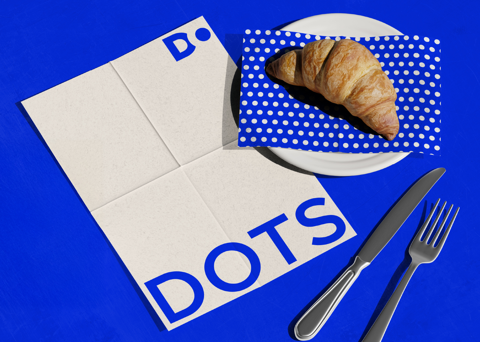
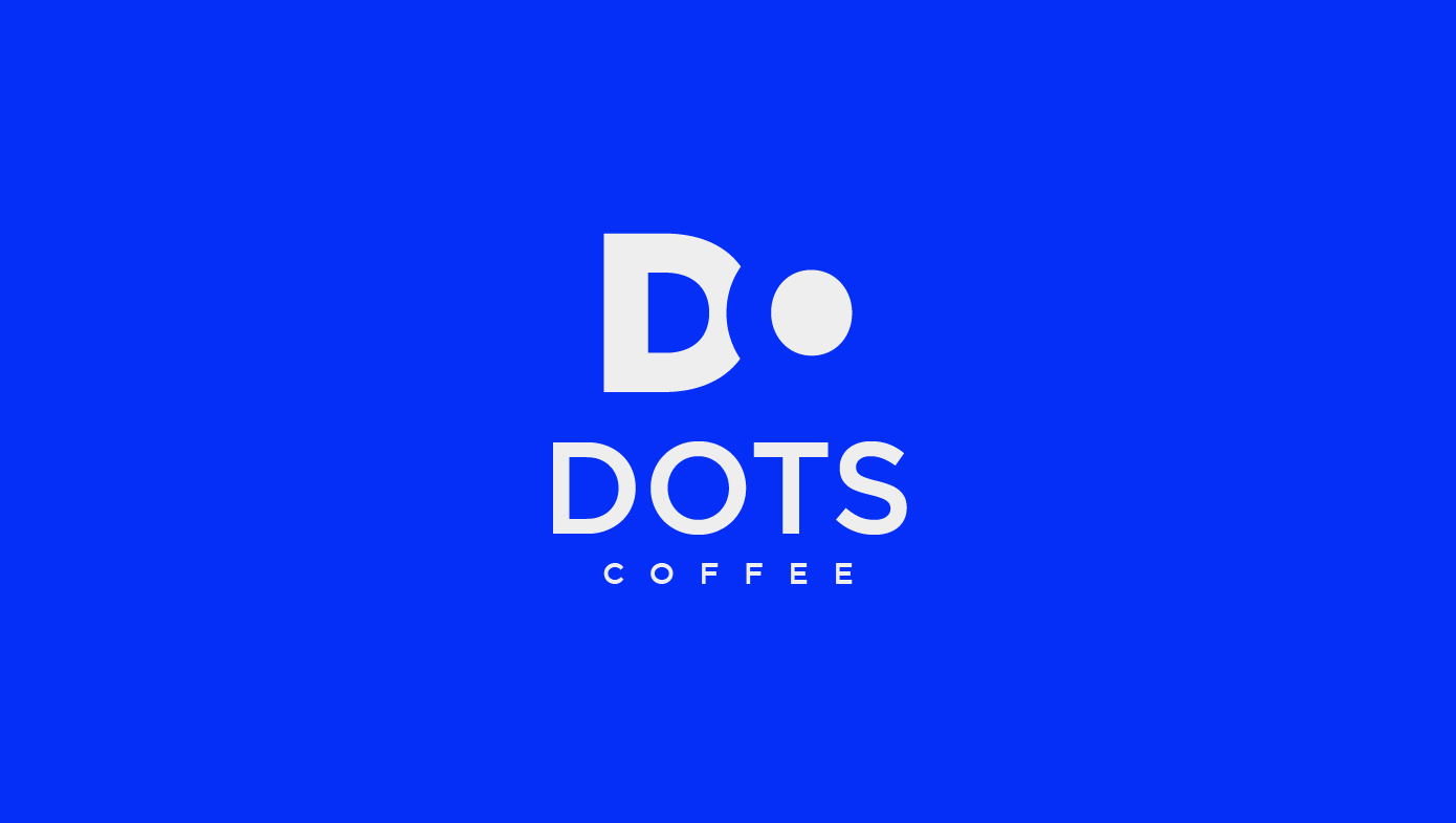
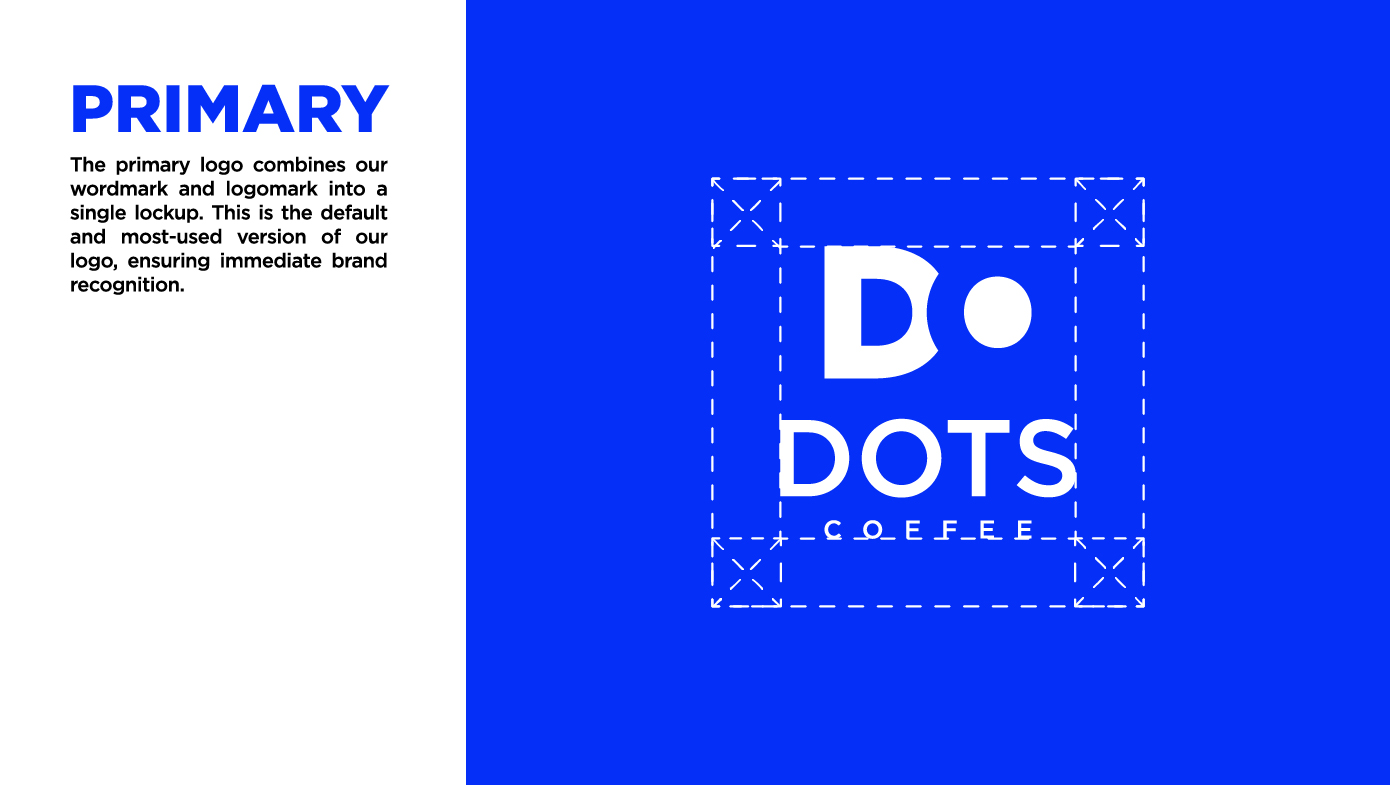
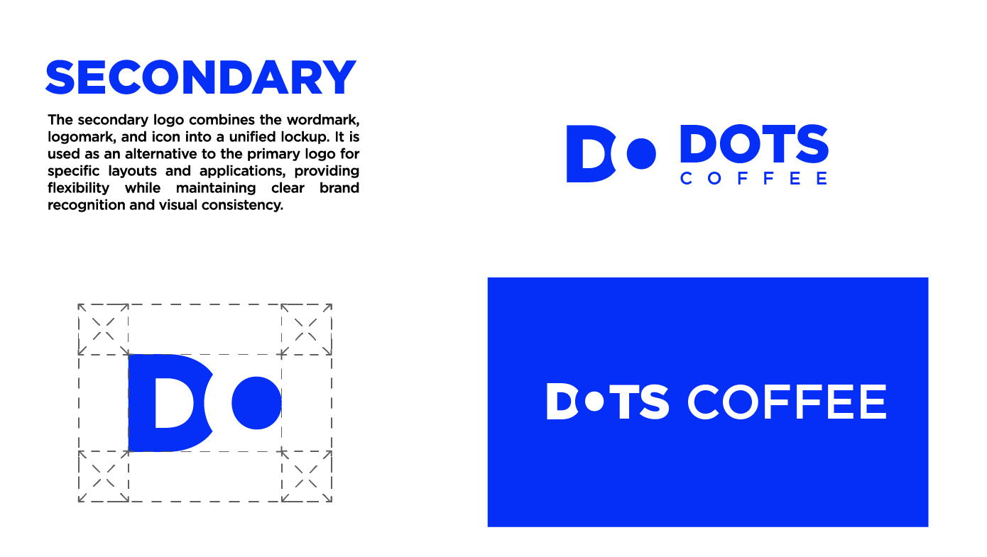
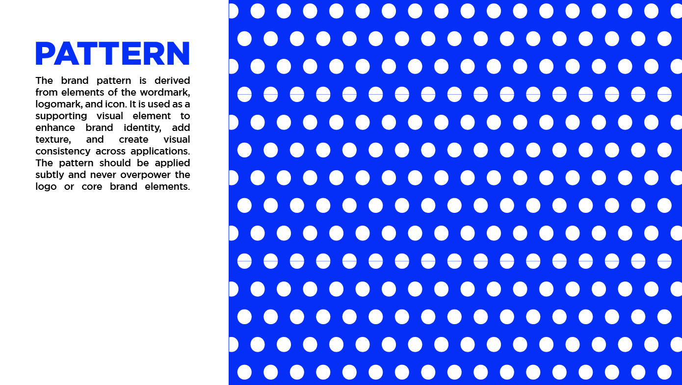
Dots Coffee is a modern coffee brand created to connect with a young, Gen Z–driven audience. The objective of this project was to design a minimalist logo using dot elements as the core visual concept, representing simplicity, connection, and creativity. The fresh, clean design approach helps position Dots Coffee as a trendy and contemporary café while maintaining a strong and recognizable brand identity across digital and physical applications.
Branding and identity
Challenge & Result
01. Challenge
The main challenge was designing a minimalist logo that feels fresh and Gen Z oriented while still being distinctive and connected to the brand name. The logo needed to stay simple but memorable, avoiding unnecessary details.
02. Result
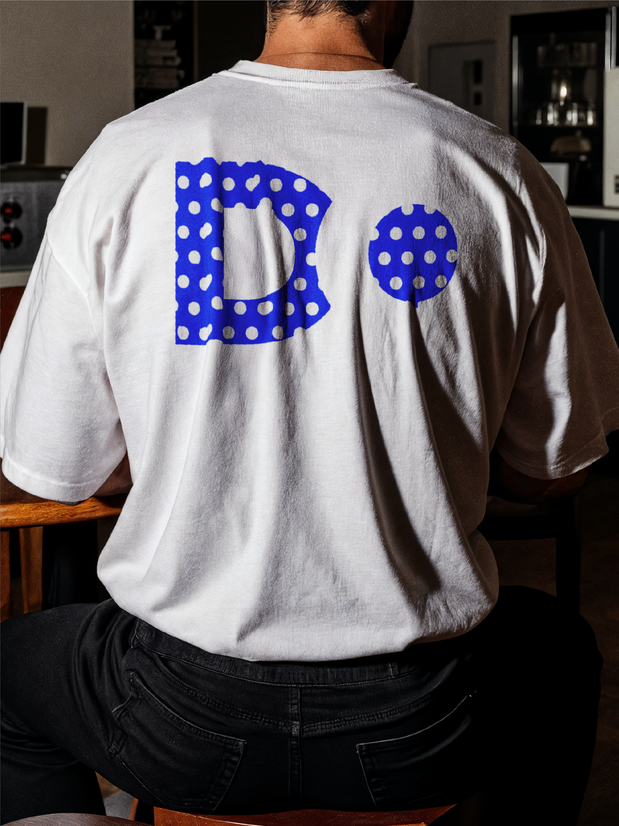
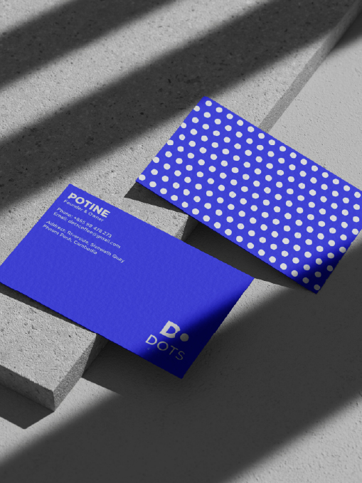
The final logo uses the letter “D” with a dot formed through negative space, creating a clean and modern visual identity. This solution is unique, recognizable, and highly adaptable for various branding applications.
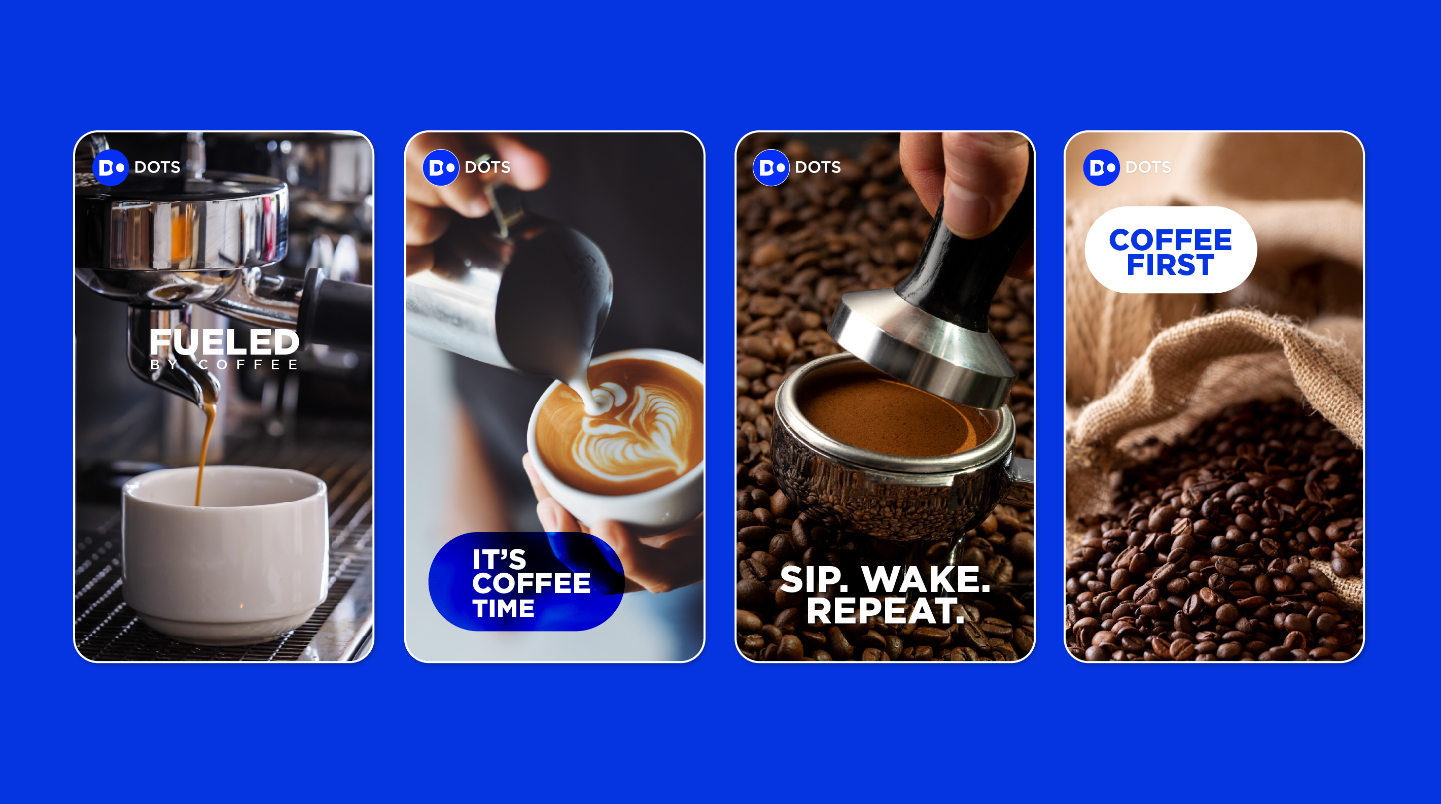
Advertising
01. Social Media
A minimalist social media poster created for Dots Coffee, using dot-based visuals and modern typography to reflect the brand’s playful yet contemporary character while engaging a young, Gen Z–focused audience.