Branding

PREK ANG KUNH

Client

Rada

Role

Branding

Duration

1 Jun 2025

Designer

Channa Chheng

Project overview

The project developed a unique logo and branding concept that reflects the resort’s focus on wellness, comfort, and a sense of home. By combining the letters “P” and “A” into a flower-like symbol and integrating a subtle home icon, the design conveys natural beauty, tranquility, and a welcoming retreat for both local and international guests.

Challenge & Result

01. Challenge

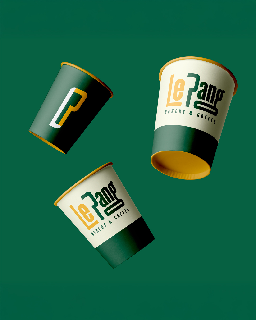
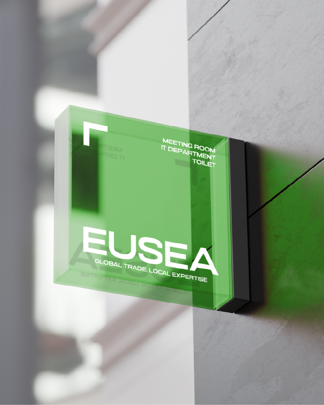
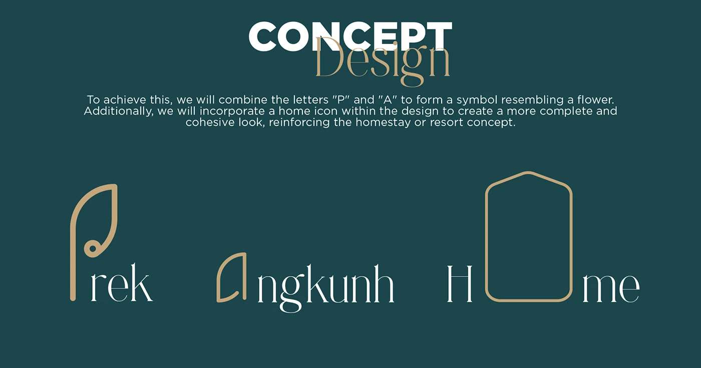
The challenge lay in achieving a delicate balance between simplicity and symbolism, ensuring that the logo carried meaning while remaining clean and elegant. Furthermore, the design needed to be adaptable for various applications, from digital platforms to physical signage, without losing its visual impact.

02. Result

The final result was a refined and versatile logo that effectively communicated the resort’s values of wellness and hospitality. The branding was praised for its thoughtful design, cultural relevance, and adaptability, helping to elevate the resort’s identity and appeal.